Wednesday 8 May 2013
Tuesday 7 May 2013
Monday 6 May 2013
Saturday 4 May 2013
Friday 3 May 2013
Thursday 2 May 2013
Wednesday 1 May 2013
Sunday 31 March 2013
Magazine Evaluation
What was the theme for the project?
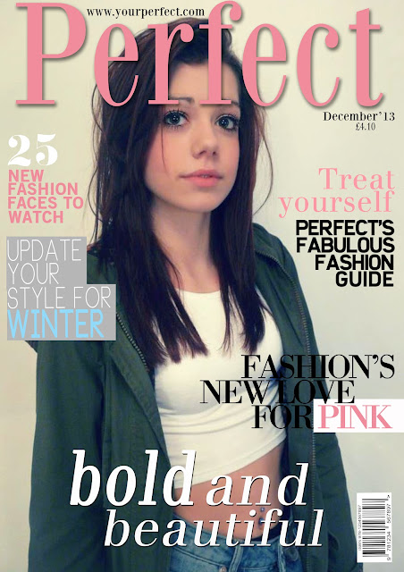
The theme of the product is vogue. It was the theme of elegance and being neat and everything in line and straight.
How have you developed your ideas? How did your work change through the project?
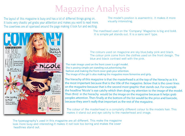
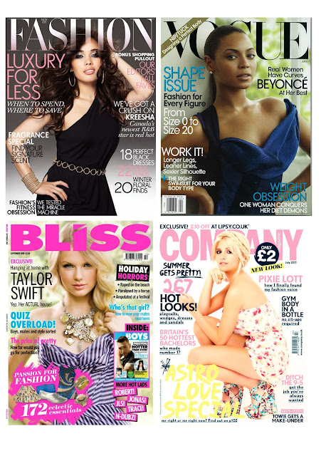
I developed my ideas by searching up magazines from vogue and other covers. I made a few designs off different designs and picked out out a few colour schemes. I also took a lot of photos of my model 'Sam' and made her try on different clothes to get different themes to my magazine I changed my work throughout the project by putting different colours together and seeing which one worked well. i also placed my cover lines and my masthead in different areas and positions to see where they looked more effective and see what place looked the best and looked like the magazine vogue.
How many photographs did you take? Do you think you should have done more or less?
I took around 10 photos of my model. I think i should of took just a few more photos as this would of gave me more variety to choose from and select the photo which suited the theme the best.
What artists or designers have you looked at to help and inspire you?
I looked at many artists and models to help me through this project,but the one i focused on the most was the fashion model Cara Delevingne. I searched up many photo shoots and magazine covers she had taken place in. I focused on the vogue magazine covers she had done and looked at her facial expression and clothing especially to make sure my magazine model posed for the theme of vogue. I also looked at the designers of vogue and viewed on how they lay out their text on every magazine. I noticed the layout was very get magazine looking like vogue i had to follow their neat layout.
What materials, tools and techniques did these artists use? Think about lighting and wardrobe.
In my magazine i used many tools and techniques to help my cover develop for example,my technique towards my text was to keep it all neat and in line. I used the ruler tool to make sure my text was exactly on the line and looked professional-like vogue. I also made sure my text (cover lines) were all equally spaced. This made the sense of neatness,simple and not messy. When designing and finally bringing my magazine together i used the 'levels' tool on photo shoot This tool controlled the brightness of items on my magazine and made me be able to experiment how bright or how dull i wanted things. I could change the contrast of my final main feature (model photo) which made me be able to change the brightness of my cover lines to enable my magazine to all come together and look equal. Before taking my photos for my magazine i researched vogue magazine cover to look at how the models were standing,what was their facial expression,what the background was like? Were they inside or outside,and finally their clothing. I noticed many were inside with a plain white background or either outside with greenery behind them. It all depended on the cover lines and season they were in.
My skills on photography and photoshop have developed really well. When searching up models and magazine covers i developed more photography skills eg- camera angles,model positions etc. When using photoshop i developed skills through out the project. Every lesson i seemed to learn something new,even if it was just how to add an effect onto text,i still learnt something new.
Are there any aspects of your studies that you wish you had explored further?
How have you used formal elements such as line, tone, colour and shape?
I have used every simple shapes and everything is in line and neat. I have tried to follow the vogue theme with only using a few colours and adjusting the tone a little.
What materials did you use, and why? Did they work successfully?
What meaning and messages did you want to convey and were you successful?
I wanted a meaning of in line,simple yet effective.
I wanted a meaning of in line,simple yet effective.
Are you happy with your final piece? Are there any elements you like in particular?
I am happy with my final piece. I like the soft pastel colours i have chosen and i am happy with my model picture. I also like the type faces i have found as i think they work really well together.
Is there anything you would change? Why?
I would maybe change the cover lines or find some more 'vogue' like ones. Also when my my final magazine was printed some on the text came out darker,so i would change the levels to make them a little lighter.
Wednesday 6 March 2013
Tuesday 5 March 2013
Friday 14 December 2012
Wednesday 12 December 2012
What was the theme for the project?
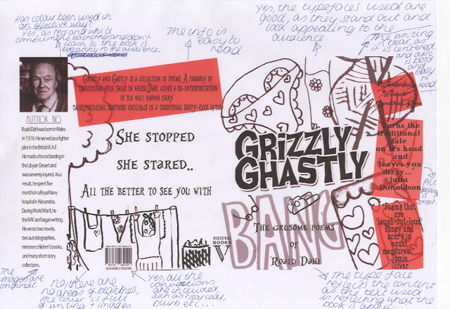
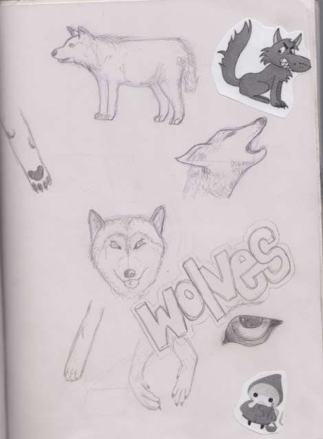
The theme for my project was associated with the poem 'Little Red Riding Hood' by Roald Dahl. The poem was a twist to the original poem which we had to consider.
How have you developed your ideas? How did your work change through the project?
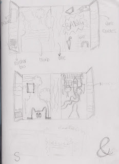
I developed my ideas from the research we did on the different artists. I experimented different ideas for my front cover and gathered all my resources to make my final design. My work changed throughout the project as i developed more skills when using photo shop and learnt more techniques which i did not know before. These techniques then made me change my work as i tried to improve my work by adding more effects and skills i had learnt.
How much reference material did you find? Do you think you should have done more or less?
I found some photos for my self,but in my future projects i should find more reference materials to help me develop more ideas and not to use every resources the teacher gives me.
What artists or designers have you looked at to help and inspire you?
I looked at Scott Cambell to inspire my ideas and how to used gouache.
What materials, tools and techniques did these artists use?
Scott Cambell used the paint gouache. He used it in messy but neat way. All his work was not exact but worked. He used alot of tone which helped me in my further work.
How have your skills developed during the project?
It has improved my knowledge in techniques and use of Photoshop. I now know lots of techniques to use on Photoshop for future projects.
Are there any aspects of your studies that you wish you had explored further?
I wish i had looked at more resources and maybe a few more artists. This would of helped me produce more ideas for my final front cover.
How have you used formal elements such as line, tone, colour and shape?
I have used one colour in my work,and that is red. The red represents blood and add a scary theme to my book cover,to fit in with the poem.
What materials did you use, and why? Did they work successfully?
I used gouache,chalk coal,pencil,ink. Yes,they worked successfully as i developed more ideas from using these.
What meaning and messages did you want to convey and were you successful?
I wanted to make my front cover funky and fun. I wanted to make front cover comic and cartoon.
Are you happy with your final piece? Are there any elements you like in particular?
Yes,i am happy with my final piece. I like how i how blown up some of my images for my background.
Is there anything you would change? Why?
I would change some of the fonts to something more funky,to fit in with the rest of my fonts.
Subscribe to:
Posts (Atom)

